Valentine's Day
|
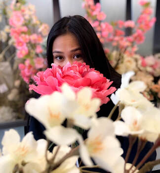
For this picture I used flowers to give the picture a nature and outdoorsy feeling to it, the I felt that the pink flowers sold the Valentine's day theme while the white flowers served as complimentary colours, The shallow depth of field in this image is used to guide the viewer towards the subject of the photo which is the woman in the middle. Some edits were made: to remove acne and blemishes, to brighten the image, and also to make the pink flowers more vibrant and the whites warmer to give the picture a warm feeling.
|
|
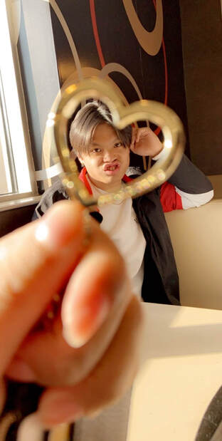
This picture was less of a serious one. The gold heart served two purposes, to add a valentine's element to the photo as well as to help guide the viewers eyes towards the subject in the middle along with the large depth of field. Not many edits were made on this photo, I brightened the photo as well as made the picture warmer and give it the same type of feel as the previous picture.
|
|
|
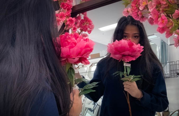
Unlike the previous pictures I went for a darker; more eerie look in this image. In the editing process I cropped the picture from portrait to landscape to better focus on the subject, which unfortunately lowered the quality, I also added a light vignette to the image to give it the dark look I desired. I used a blender, I think that's what it's called, to remove any blemishes or acne, I also made the pink of the flowers more vibrant to allow them to pop out and contrast with the darker; more bland background.
|
Patterns
|
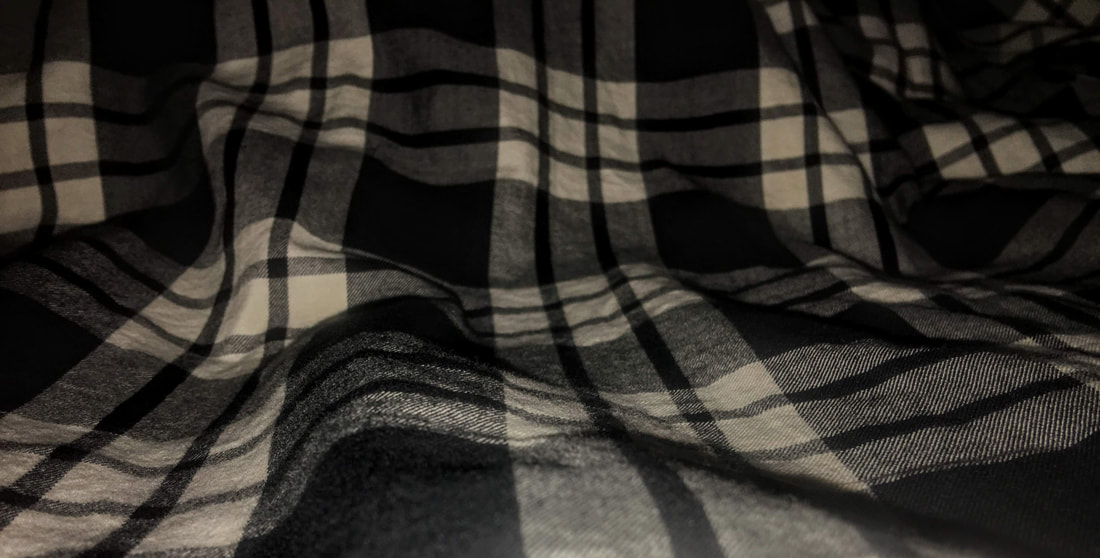
in this picture i used a black and white flannel from my closet and tried to go for a more three dimensional look, The creases in the shirt helped to make it pop out a little bit more. In the editing process I cropped the photo to really help get the look that I wanted, I also darkened the photo to give it a more gloomy look.
|
|
|
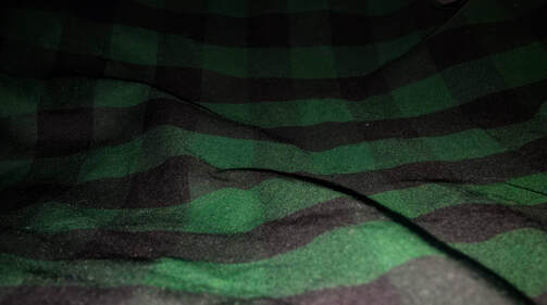
I looked for the same type of gloomy look in this picture but this time using a green and black flannel, again trying to give the piece a more three dimensional look rather than flat one. In the editing process the image was darkened a lot and crop to the right size, I struggled to remove any extra light found in the image by removing and adding colour until i got the best look i could.
|
|
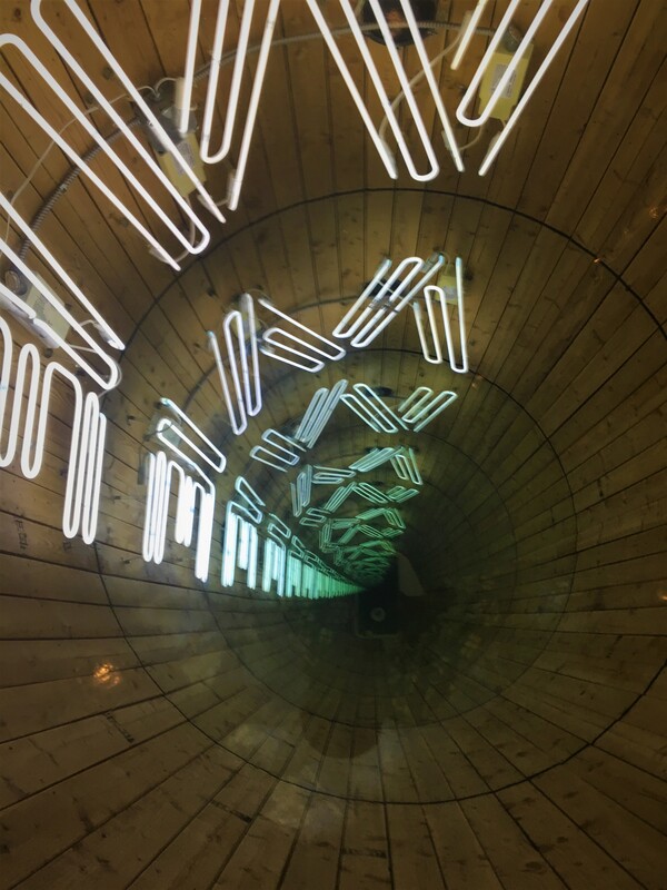
In this picture I made colour one of the most important aspects.I wanted the picture to give the same type of feeling as when standing in a cabin so in the editing process I brightened the colour of the wood it would stand out a little better, I also lowered the brightness of the whites a bit so as to make the image easier to look at.
|
|
Fridge picture
|
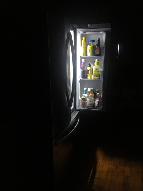
This was a picture of my fridge, not much more to say, I tried to go for a dark and mysterious type of look and have the light from the fridge be a direct contrast to the rest of the image which was the reason for the dark background. While editing further darkened the background to add to the mysteriousness then brightened the light coming from the fridge to make the picture turn out as it did.
|
